

In a 1952 paper published in the Journal of Finance titled Portfolio Selection, Harry Markowitz laid out a framework that literally transformed the landscape around how portfolio management should be done. Later dubbed the Modern Portfolio Theory or MPT, that seminal paper would go on to eventually earn him the Nobel Prize in Economics about four decades later. And you might have come across a bit of this if you are doing anything remotely tangential to institutional money management. Or at least you should have. Heck, even if you are not a professional money manager, it’s not all bad to at least be aware of what this is all about. Who knows, you might be better at this than the so-called professionals.
So what’s the paper about? Designing diversified portfolios through the use of uncorrelated asset classes as a way to invest optimally with a goal to earn the highest rate of return for a given level of risk. Yes, it’s a mouthful but this simple yet intuitive approach to portfolio management didn’t exist until 1952. At least no one attempted to formalize it and present it in a way he did.
And the ‘right’ amount of diversification is all about correlation or to be more precise, uncorrelation between different investments in a portfolio. Owning stakes in 10 different technology companies is not diversification. Or spreading your bets between say a portfolio that invests in the Dow vs. the S&P 500 index is not diversification. How do we know? Because again, correlation but before we jump into that, a bit about the different types of investments or asset classes you could consider to design your portfolio.
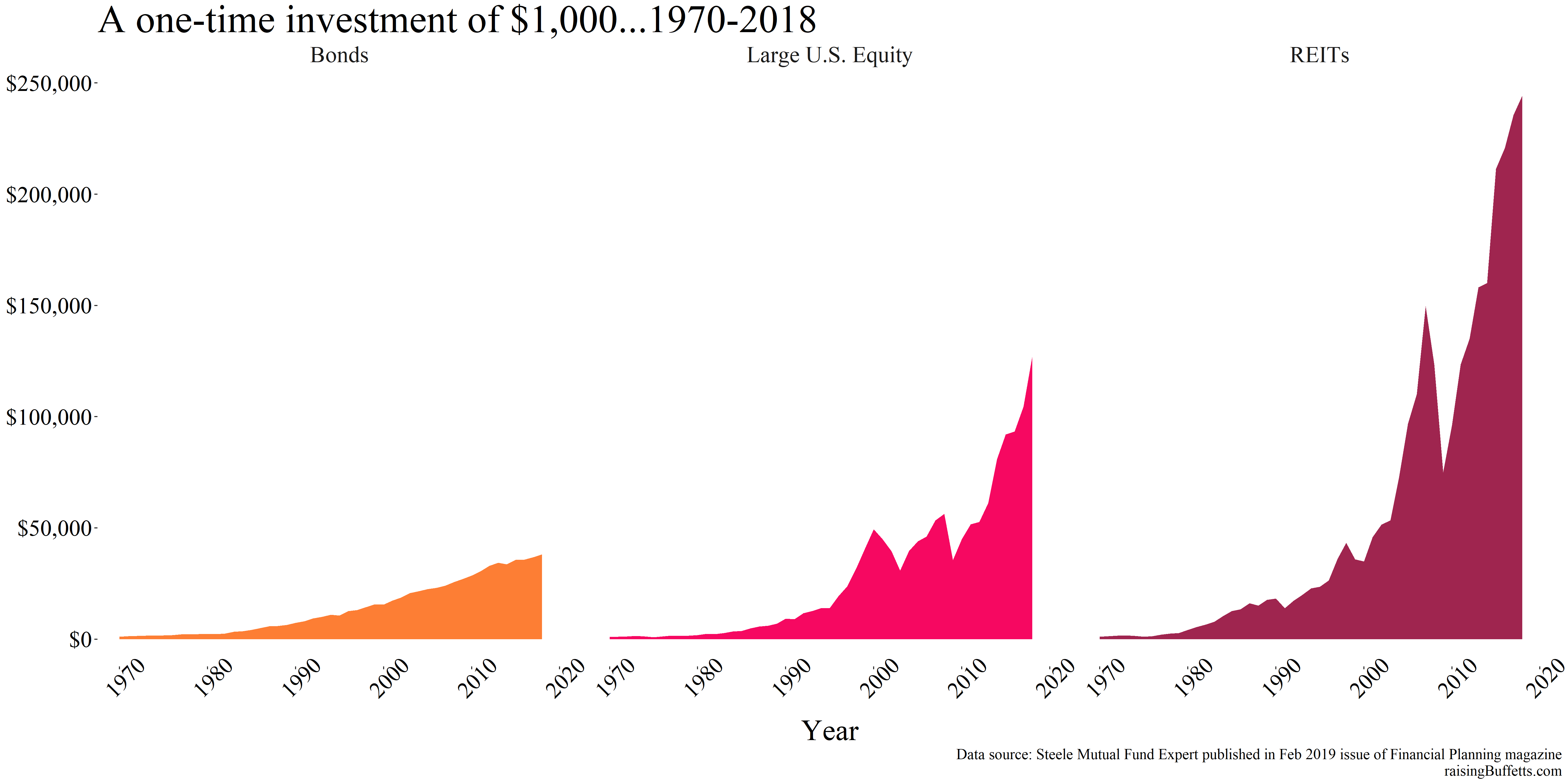
So we know an investment. Buying that stock in the hope that it appreciates in value while it pays dividends (or not) is an investment. Buying that bond that pays interest until it matures is an investment. Or that piece of real estate that provides rental income is an investment. But what’s an asset class? I got my hands on returns data published in the Feb 2019 issue of the Financial Planning magazine by the Steele Mutual Fund Expert for 7 major asset classes going back to 1970. We’ll use this and probably some other data series to do whatever we need to do here.
Those asset classes are Large U.S. Equity, Small U.S. Equity, Non U.S. Equity, Bonds, Cash, REITs and Commodities.
Large U.S. Equity comprises of all large publicly traded companies in these United States. What constitutes large could be different based on the organization assembling that asset class but in general, it means all companies with market capitalization of $10 billion or more. Then there’s an asset class that owns small companies. There’s one that owns non-U.S. companies, there’s one that owns bonds, real estate etc.
Real estate here is not the home you own. Owning that is akin to owning a single company stock or a bond. Real estate here is the entire real estate sector represented by REITs or Real Estate Investment Trusts. What’s a REIT? It’s a publicly traded entity that owns or finances income producing real estate spanning a variety of sectors. For example, that mall you just visited, that could be owned by a REIT. Or that apartment complex where you rent your home? That’s more than likely owned by a REIT. So is that office park or that hospital etc. So a REIT might specialize in one type of real estate but REITs as an asset class gives you broad exposure to every type of real estate. That’s diversification but diversification within a segment of an economy.
And commodities is exactly what it means, owning commodities like gold, silver, copper, oil, wheat, corn etc. You don’t own them physically but you own a stake in a collection of them and someone holds and keeps them safe for you. Yes, you have questions and I’ve got to explain more but for now, just assume that you bought a collection of stuff and held it till 2018 (the last year for which we have data for).
But why not do all this portfolio optimization with individual stocks? Or say bonds? The math is the same so it is doable but what we have here is 49 years of data. And we know a lot can change in 49 years. How much? Take the Dow Jones Industrial Average (DJIA) index for example and compare its constituents in 1970 to the present day constituents.
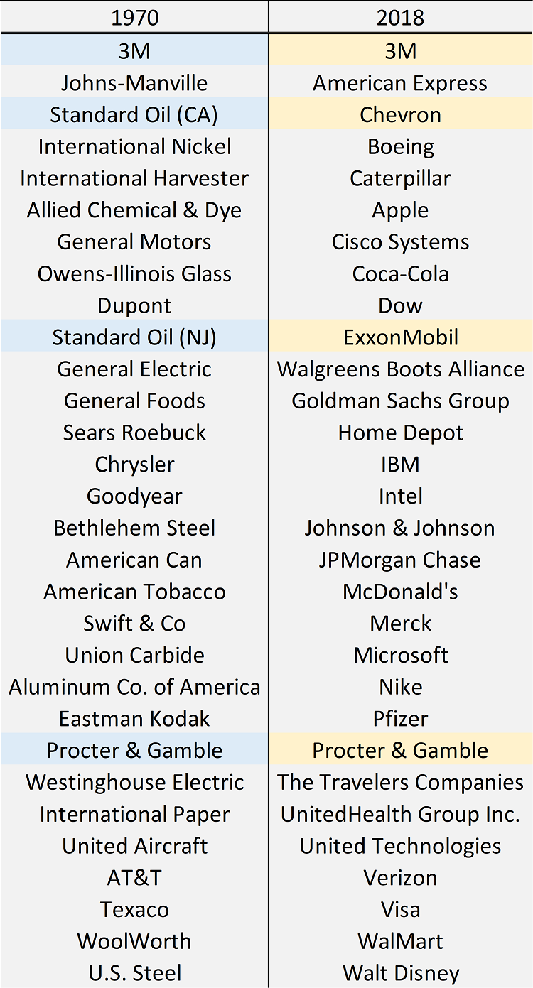
Only 4 companies that existed in 1970 still remain in the Dow. What happened to the rest? Some got acquired or merged with other companies but most flamed out. And yet the DJIA continued to march on higher from around 800 points in 1970 to 26,000 points today. And that’s not factoring in any dividends. So if you’d done this math in 1970 with the companies of that time and built a portfolio around them, your situation is likely not looking that hot now. And building statistics-based portfolio models requires that the asset class does not vanish which it does in many cases when you build a portfolio around just individual stocks and bonds.
Okay, so we have returns data on these seven asset classes. How can we get a sense of how they have performed over these many decades? We start with the distributions. What do they look like? Are they narrow or wide? Is there any bimodality in the data? All this with this one plot below.
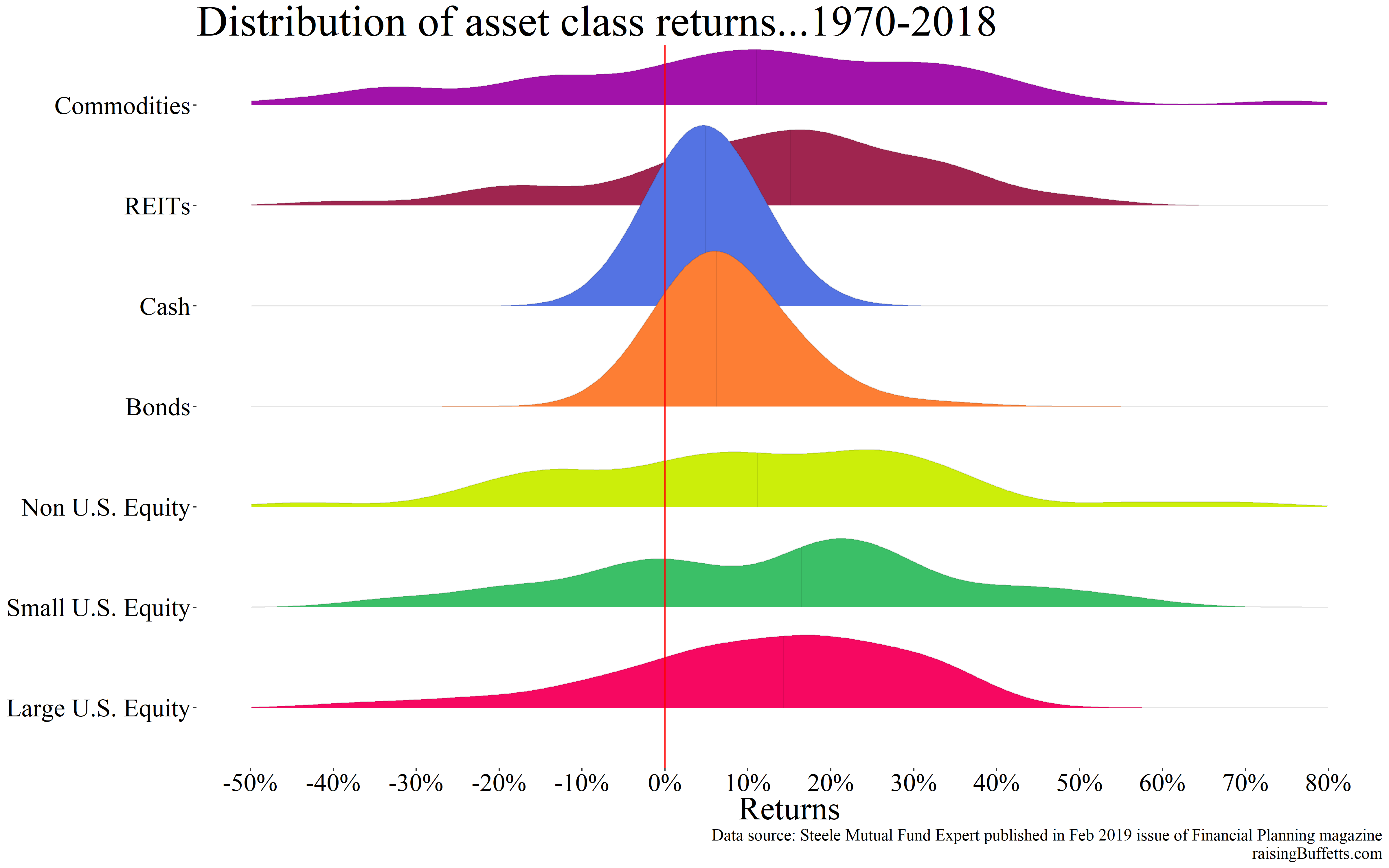
Stacking the plots makes comparisons easy and here’s what we can conclude…
- That faint line in the middle of each plot is the median. Half the returns are below that line and half above. From what I see, small U.S. equity seems to have the highest median returns followed by real estate and then large U.S. equity. I say median returns for large U.S. equity and real estate are almost identical. Median returns for commodities and non-U.S. equity are comparable which are then followed by bonds and then cash. So we should know which one would have generated the most amount of wealth, right? Small U.S. equity for now but we’ll see.
- As long as the returns are randomly distributed, you’d want more of them to be on the right of the 0% line than to the left which happens to be the case with each asset class above.
- Cash and bonds have lower spreads (risk) and lower median returns than other asset classes. That’s expected if you believe that there should exist a risk premium as you take on more volatility with your investments.
- The spread (standard deviation to be more precise) for commodities appears to be the widest but quite a big chunk of the returns happens to be on the left of the zero line when compared to other asset classes. That has implications and we’ll see.
So what made the most amount of money?
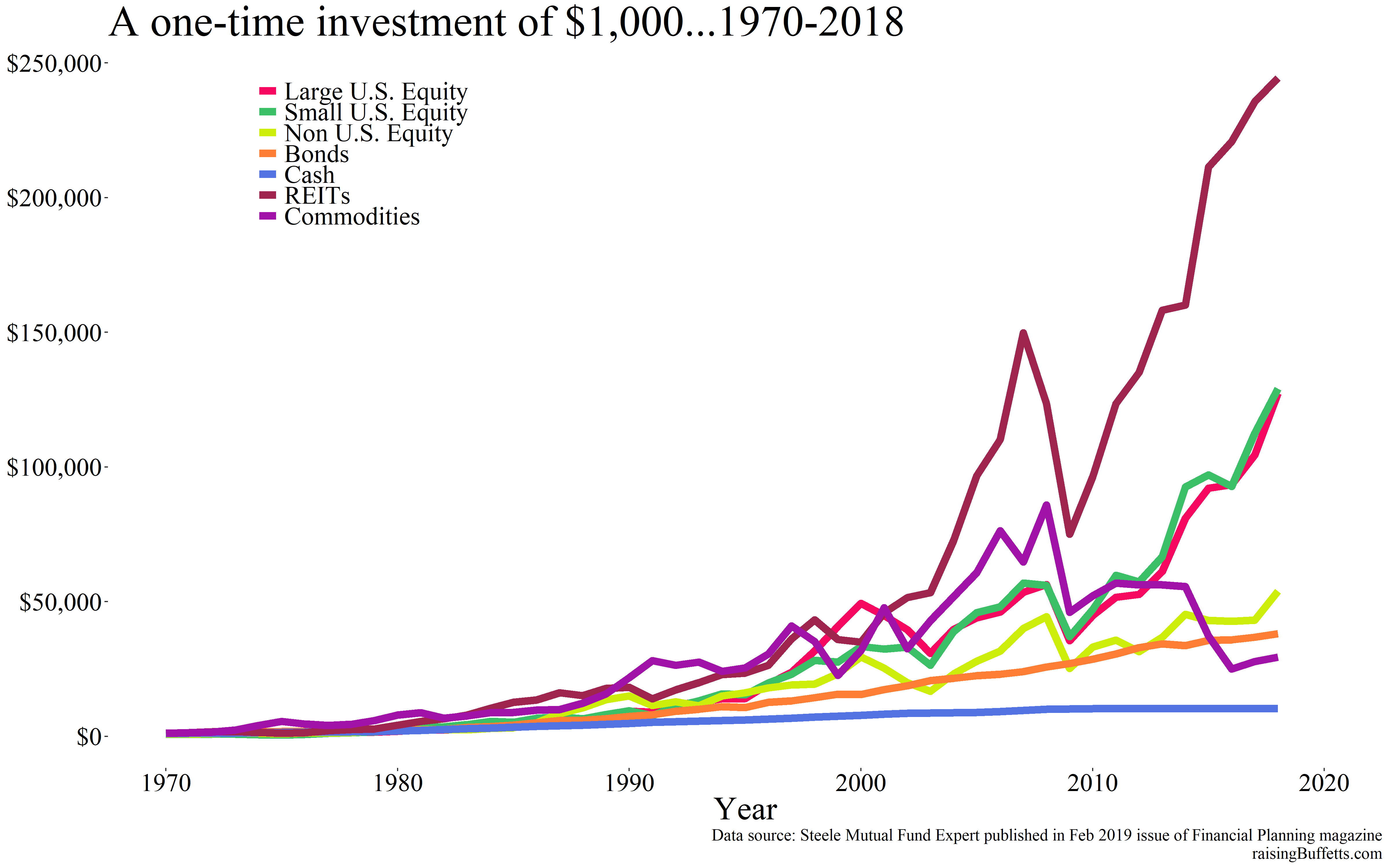
Real estate or REITs to be more precise and by a wide margin. And look at the difference in value between that and say small U.S. equity. Almost a double in REITs vs. small U.S. equity even though the median return for small U.S. equity is in fact higher than that for REITs. So why this apparent discrepancy?
You would have sensed it by looking at the spreads but variance or the volatility in returns is what makes that big of a difference. Not that REITs didn’t have years where the returns were negative but they were not as many as small U.S. equity. And look at commodities. You would have made more money being an investor in supposedly safe bonds than in commodities even though there were more years with higher returns in commodities than they were for bonds.
Before we move on, a bit about the median and the mean (average). Median is the half way point when you sort a data series in ascending or descending order. Say you have a data series with 5 data points; 3, 2, 5, 9, 7. The sorted series then is 2, 3, 5, 7, 9. The median hence is the number 5. We know the average or the mean and that is (3 + 2 + 5 + 9 + 7) / 5 = 5.2. Had to get this out of the way because up until now, we have been making statements using the median values but we need to come back to the mean because that is what this is all about.
The summary then for the average or mean returns and volatility for the 7 asset classes under consideration is as shown below.
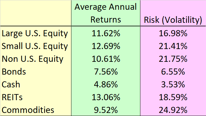
REITs actually earned just a hair bit higher annual returns on average than small U.S. equities but with 3% lower standard deviation. And an investment in commodities sucked even after earning 9.5% returns on average and thank the volatility number associated with that asset class for that.
So just returns are not enough. Risk adjusted returns is what counts. A 50% drop in the value of your portfolio does not take a 50% return back to break-even. You need a 100% return to get back to what you started out with. So minimizing that drop in the first place means that it would be a lot less harder to come back to where you were in case your portfolio experiences bouts of volatility. Which it will from time to time.
But even investing in the ‘best’ of asset classes did not come without its own issues. Compare for example bonds to large U.S. equities and REITs.
Bonds of course didn’t make you as much money but they allowed you to sleep like a baby as is evident from the drops in value above from time to time for large U.S. equity and REITs as compared to bonds. Another way to calculate the frequency of heart burns you’d have to endure is to compare drawdowns between the three asset classes.
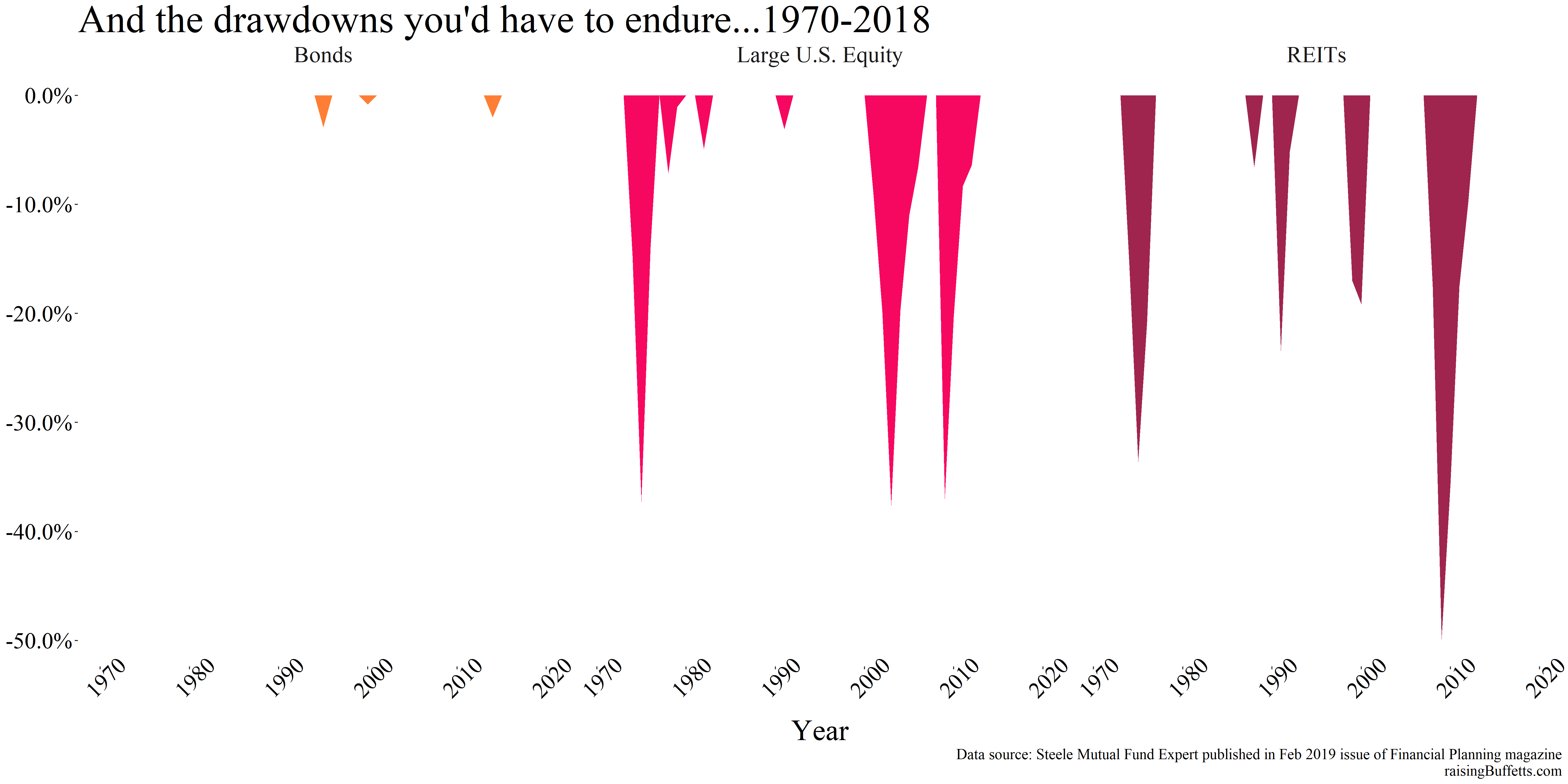
So quite a few times, you experienced gut-wrenching drops in the value of your portfolio in REITs and in large U.S. equity even though in the end, you came out way ahead. And there’s no guarantee of anything. That 50% drop could have turned into a 60% or a 70% drop. That’s the price you paid to make all that money by persevering and hanging on through that for dear life. And that’s if you did but not many do.
If you cannot handle this extent of volatility, you add bonds and cash because as you can see, there’s hardly any volatility associated with either of them. You didn’t make a killing but as stated before, you slept well. But there’s a caveat especially with bonds which we’ll get to later.
So how big of a slice should bonds and cash occupy your portfolio? Or better yet, how can you create a portfolio that lets you choose the amount of heart burn you are willing to endure? And what’s the ideal portfolio mix that gets you the best return with the least amount of risk? We use mean-variance optimization (or as Fredo would say, “I’m smart.”) to attempt to answer such questions.
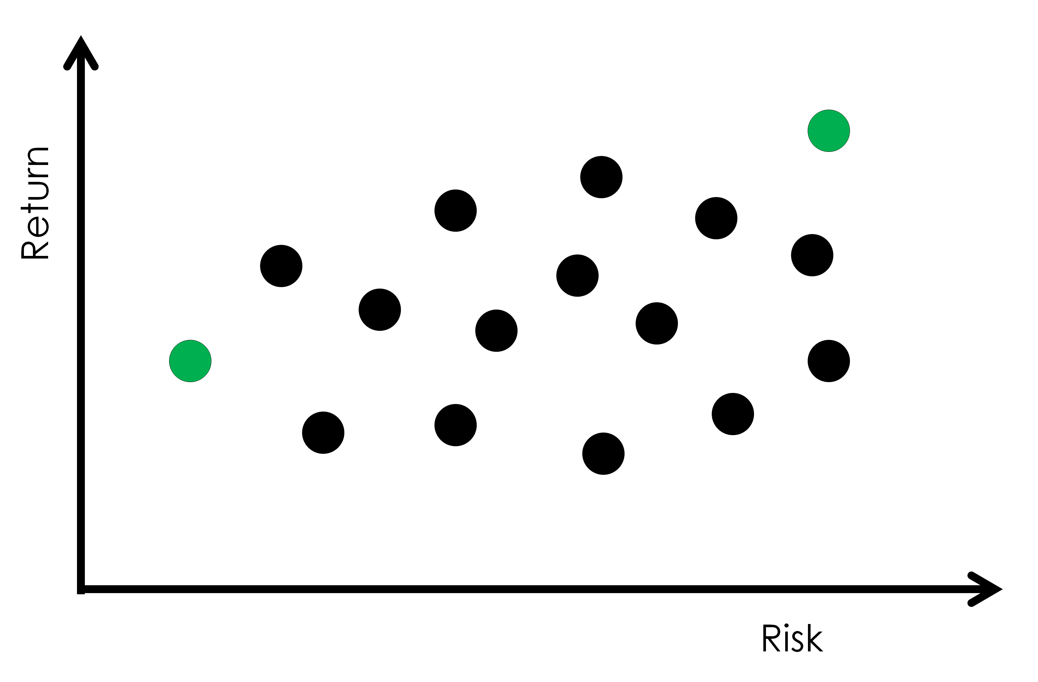
Say you mix and match different investments in varying proportions and you get portfolios with risk-return scenarios like below.
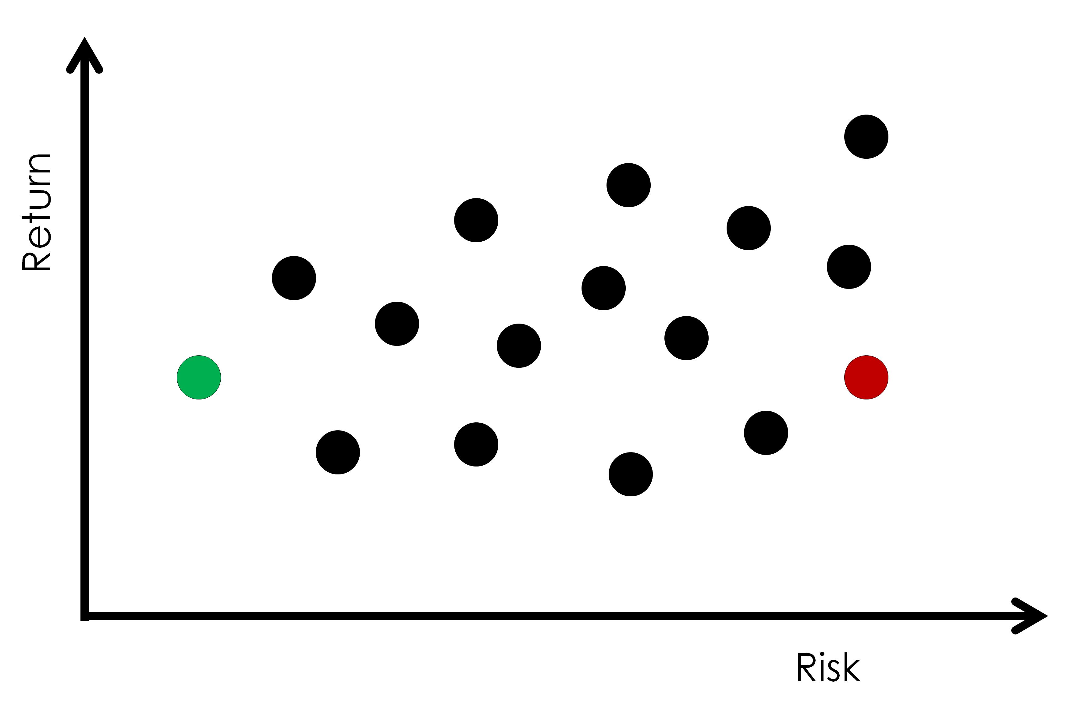
Risk here of course means volatility (standard deviation). One of those portfolios is marked in red and the other in green. Both delivered the same return but with starkly different risk levels. And of course you’d pick the lower risk portfolio for the same given return.
Or how about the two portfolios below in red and green?
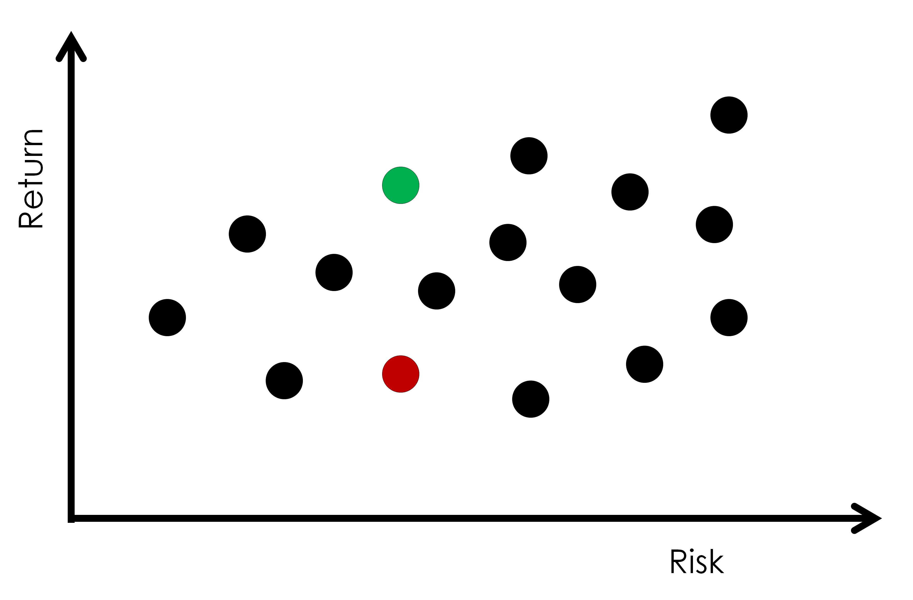
You’d not pick a portfolio that’s red over say green. Why would you.
Or say you are 22, just out of college and in your first job trying to decide what investments to populate your 401(k) with. You could and should decide to go all out on the risk-return spectrum by choosing a portfolio shown in green on the far right below. You don’t quite yet have as much financial capital to worry about volatility but you sure do have plenty of human capital ahead of you that you’d slowly and eventually convert to financial capital. And because you are adding to your savings with each paycheck, a bit of volatility might actually help than hurt as you get more opportunities to accumulate assets at depressed prices.
Or you could be in retirement where you have pretty much exhausted your human capital and are sitting on a boatload of financial capital that you would slowly extract to live on. You’d rather then own the portfolio in green shown on the lower left.
You would have sort of noticed a theoretical upper bound across the risk spectrum in terms of the returns you can expect from combining investments in varying proportions as shown below.
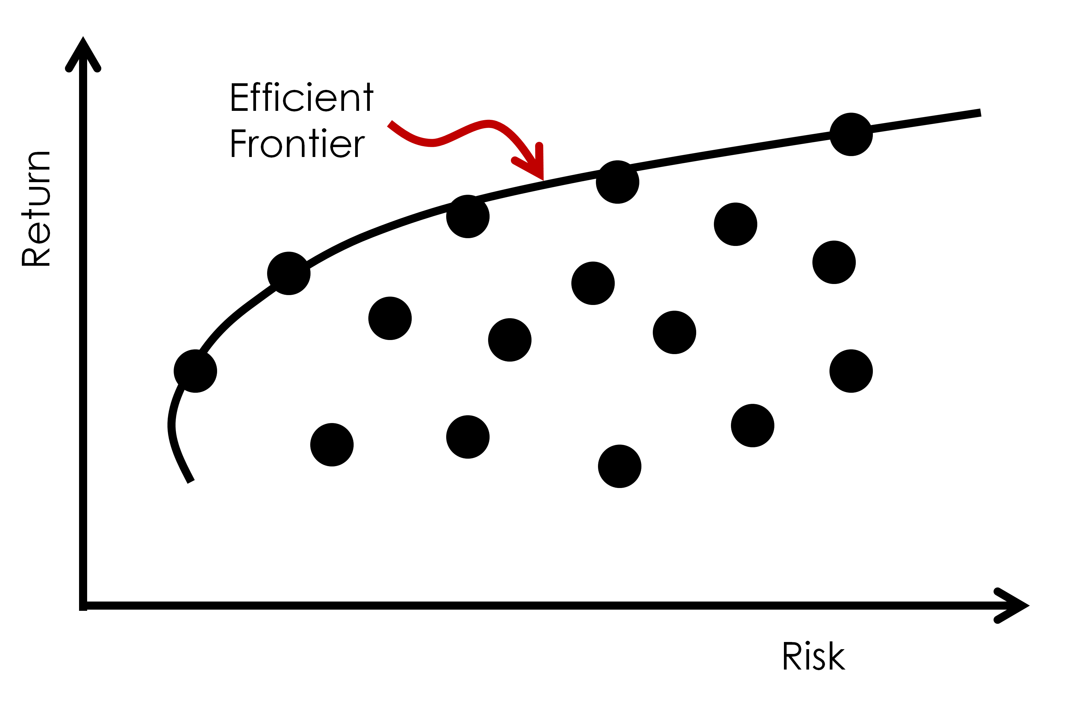
That’s what’s called the Efficient Frontier. Portfolios on that frontier are considered optimal, offering the highest expected return for a given risk. Portfolios that lie below that frontier are considered sub-optimal and do not generally compensate for the portfolio risk you bear.
So now that we’ve got that straight, we’ll use the data we have on those asset classes and assign them weights in 10% increment and create portfolios (7,658 of them in total) to see which ones lie where on this risk-return spectrum.
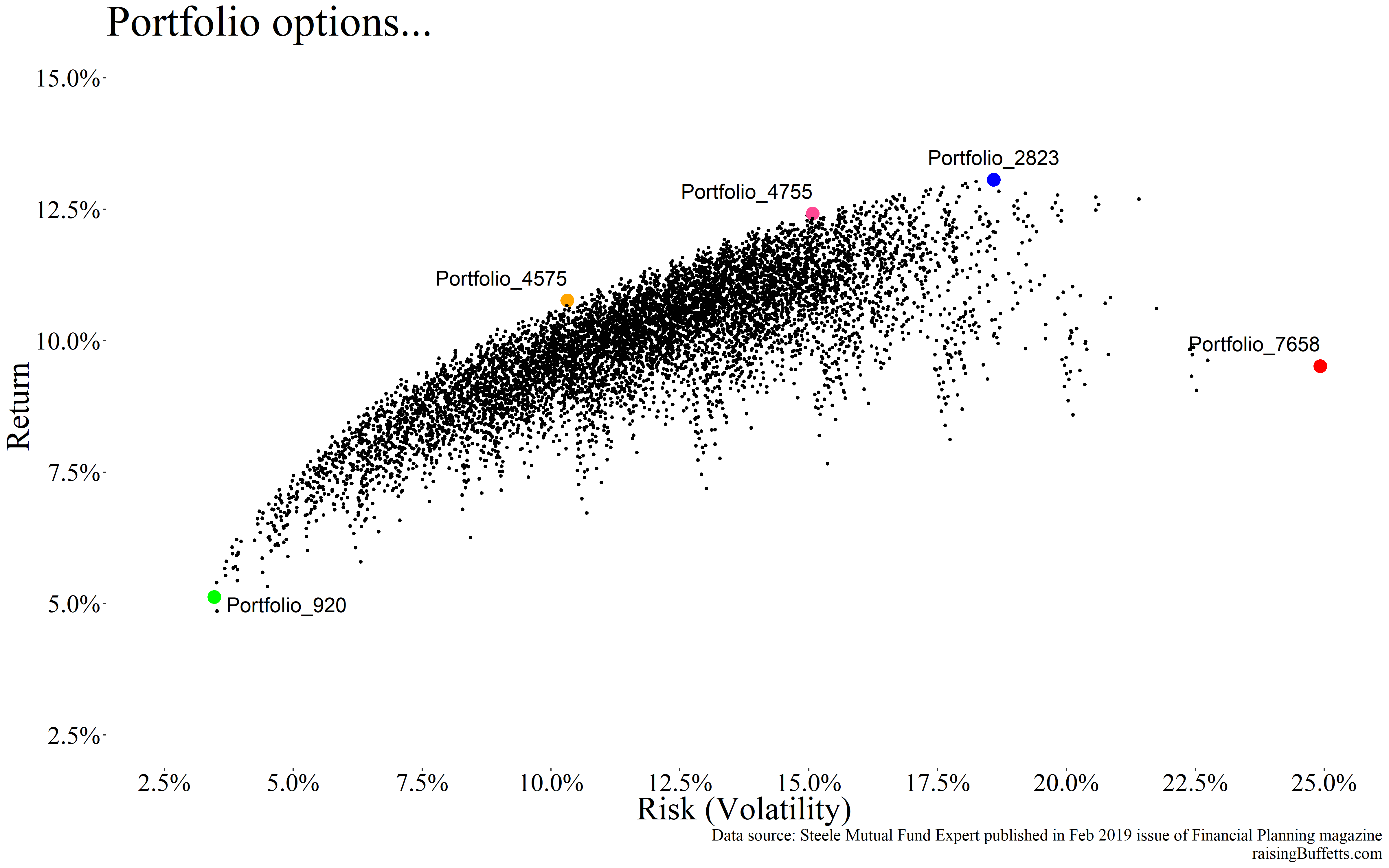
We’ll pick 5 different portfolios to dig a bit deeper into their contents and to extract any insights if any.
Portfolio_7658 is the highest risk portfolio that’s allocated to and you guessed that right, 100% into commodities. And it’s not an optimal portfolio because it’s nowhere close to the Efficient Frontier.
Portfolio_920 is the lowest risk one that owns 10% bonds and 90% cash. No surprise there.
Portfolio_2823 delivered the highest average return and it’s comprised entirely of REITs. Again, expected as we saw before.
Portfolio_4575 lies on the Efficient Frontier with 10% volatility. It’s allocated to 20% large U.S. equity, 30% to bonds, 40% to REITs and 10% to commodities. A bit decent but not ideal and will explain why (I am not done yet 🙂 ).
Portfolio_4755 lies on the Efficient Frontier as well but with 15% volatility. It’s allocated to 20% large U.S. equity, 70% to REITs and 10% to commodities. Again not ideal.
So now you start to see issues with formulaic approach to portfolio construction. Some don’t make sense, some are too heavy into a few asset classes and some are overly lop-sided. But just for the fun of it, we’ll see what each of these portfolios did if you’d picked one of them at the start of the period and rebalanced annually to the same allocation you started out with.
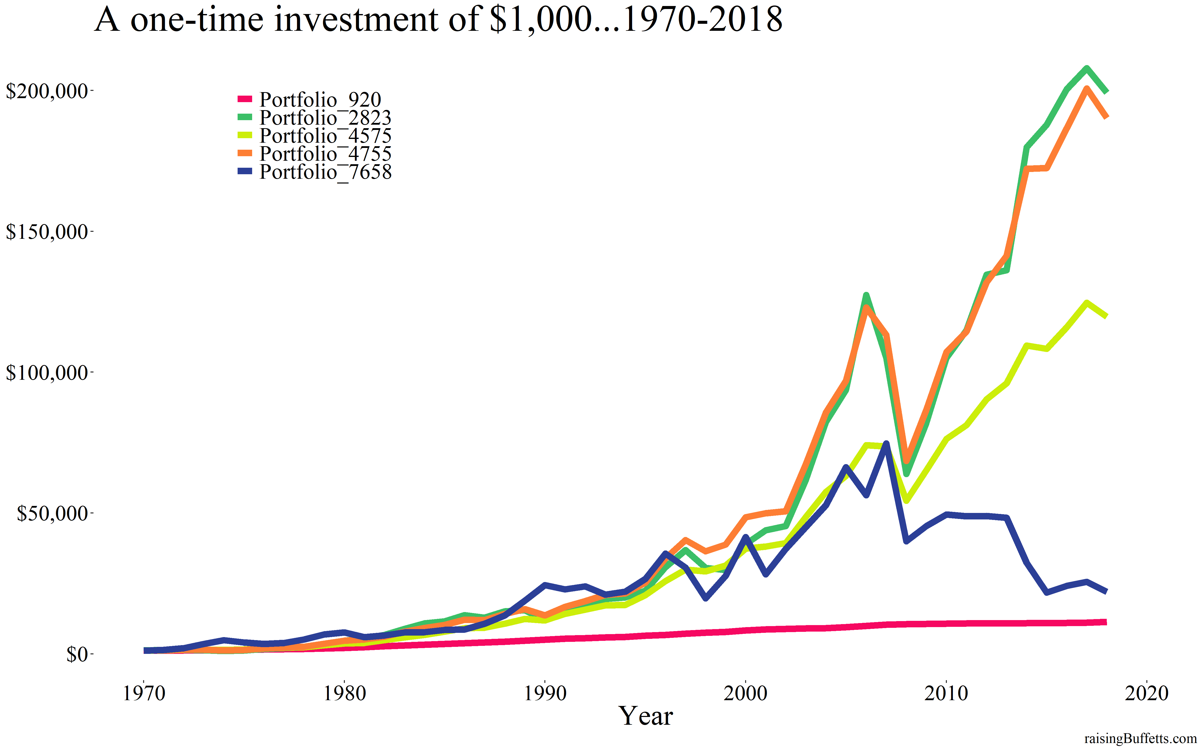
As expected, Portfolio_2823 did the best as it was entirely comprised of REITs. Portfolio_4755 did about the same and was more diversified. I would have picked that over Portfolio_2823 any day though that still was REITs heavy.
But the entire premise of all this is that it relies on historical data. You can do all the math you want but we know that thing we hear everywhere we look. And that is, past performance is not a predictor of future results. How would you have known to pick only REITs when you created that portfolio 50 years ago? That’s your entire adult life. You’ve got this one shot to get from point A to point B so taking that chance requires a level of obliviousness that borders on well, obliviousness. Or even if you did pick it ‘right’, what are the chances that you hung on through all the ups and downs that a heavily concentrated portfolio would have exposed you to.
Plus what happened in the past is unlikely to be repeated again, at least not in the same way and that’s all due to what interest rates have done over these last many decades. Take bonds for example.
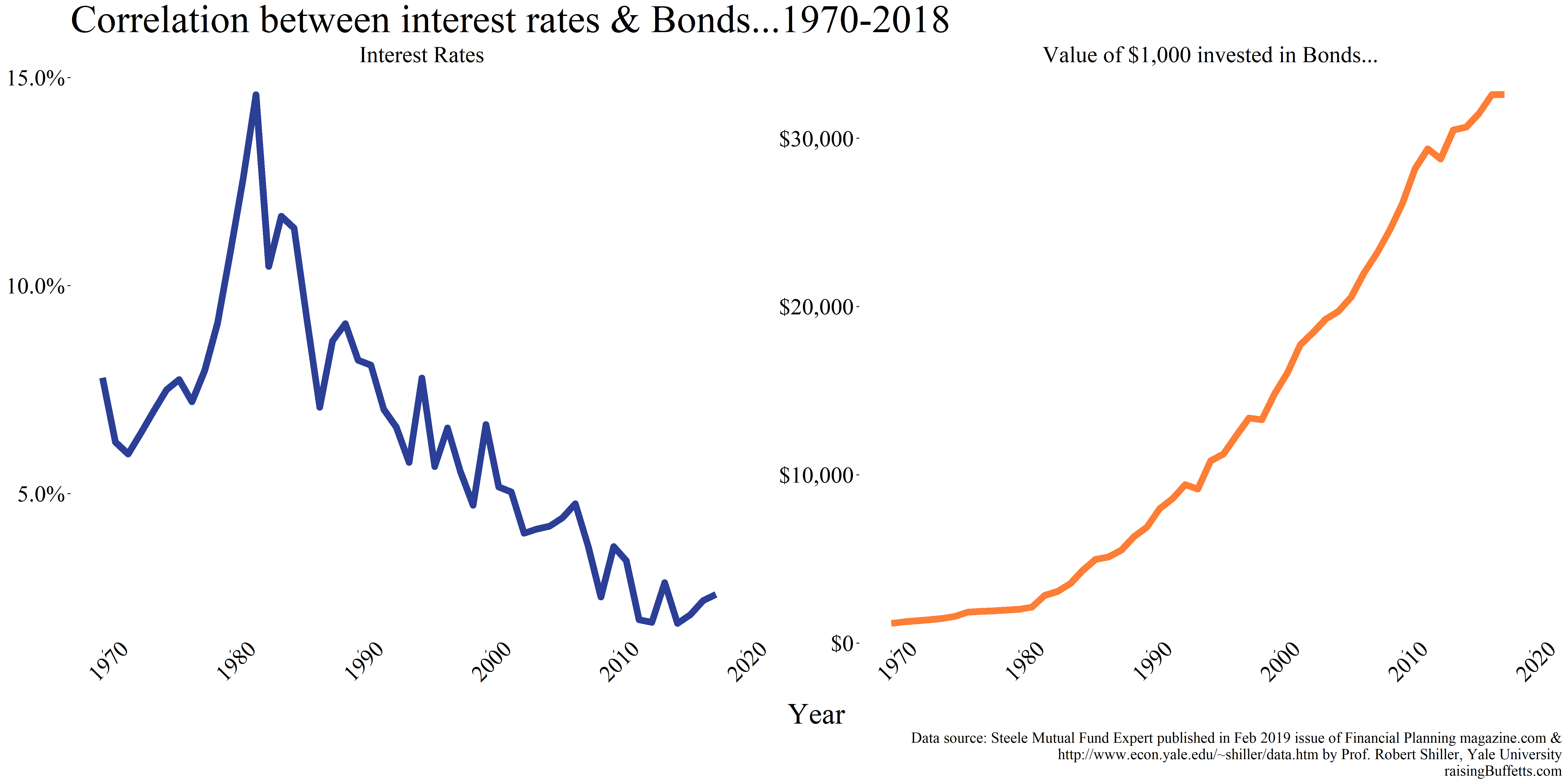
We know the deal with bonds. As interest rates go down, bond prices go up. And up they have with the relentless bull market in bonds since the early eighties when interest rates were double digits to where they are now. Can the bond bull market continue? Not a chance and hence building portfolios based on historical returns data on bonds will of course not turn out great.
That interest rate tailwind is there for stocks as well.
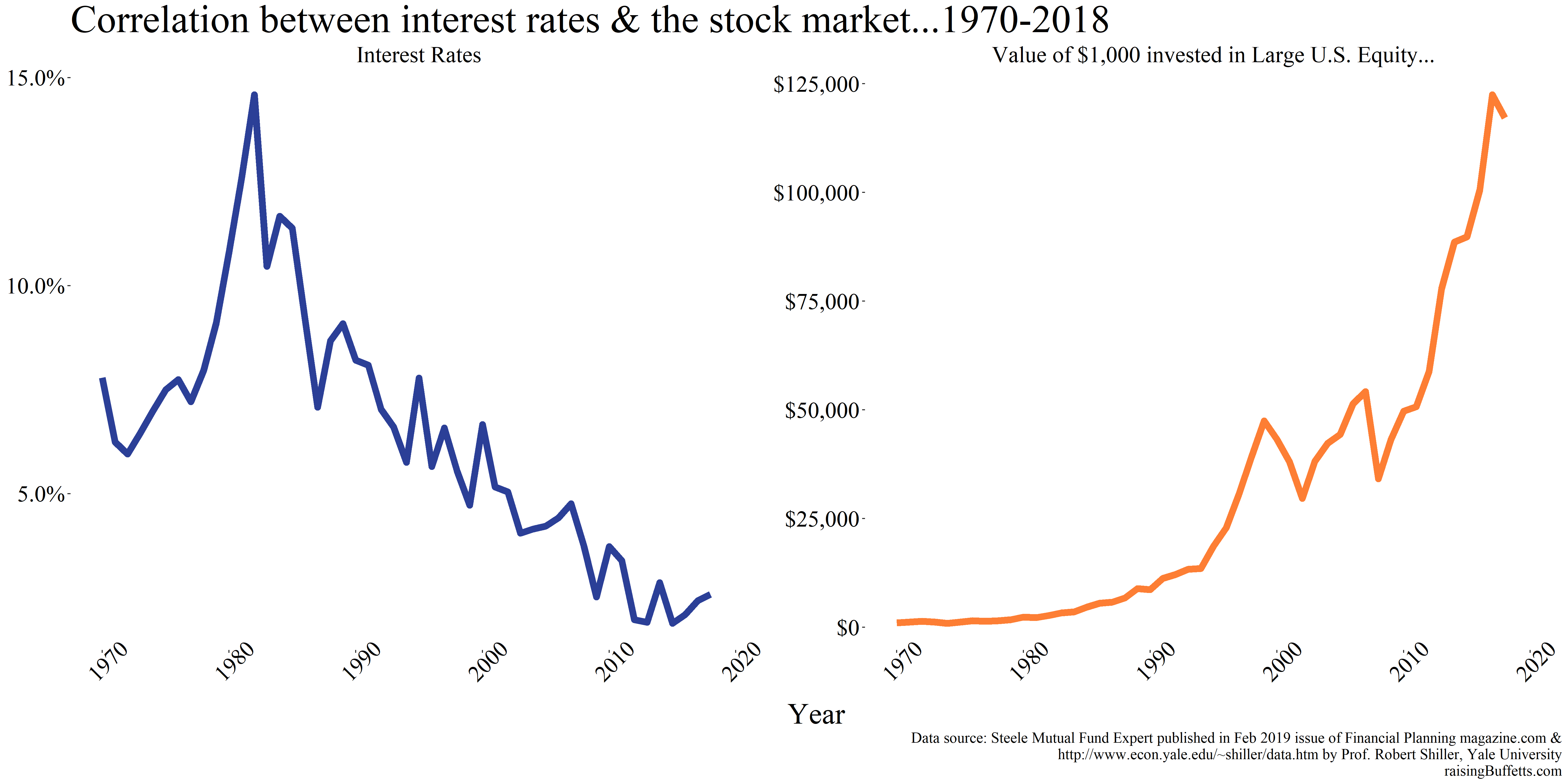
Why? Say you need to make a capital investment to increase production of whatever stuff you are in the business of making. So you go to a bank for a loan for say a duration of 10 years. The prevailing interest rate at the time is say 10%. Now you make those interest payments on time for the first year and record whatever profits your business generated which of course is net of interest expense. But say the rate declined to 8%. What would you do as a steward of that business? You’d run to the bank to refinance at the now lower rate. You suddenly don’t have as much interest expense and hence your net profit rises. And so does the value of your business or the stock price, all else remaining constant.
And it’s even truer with real estate than with stocks.
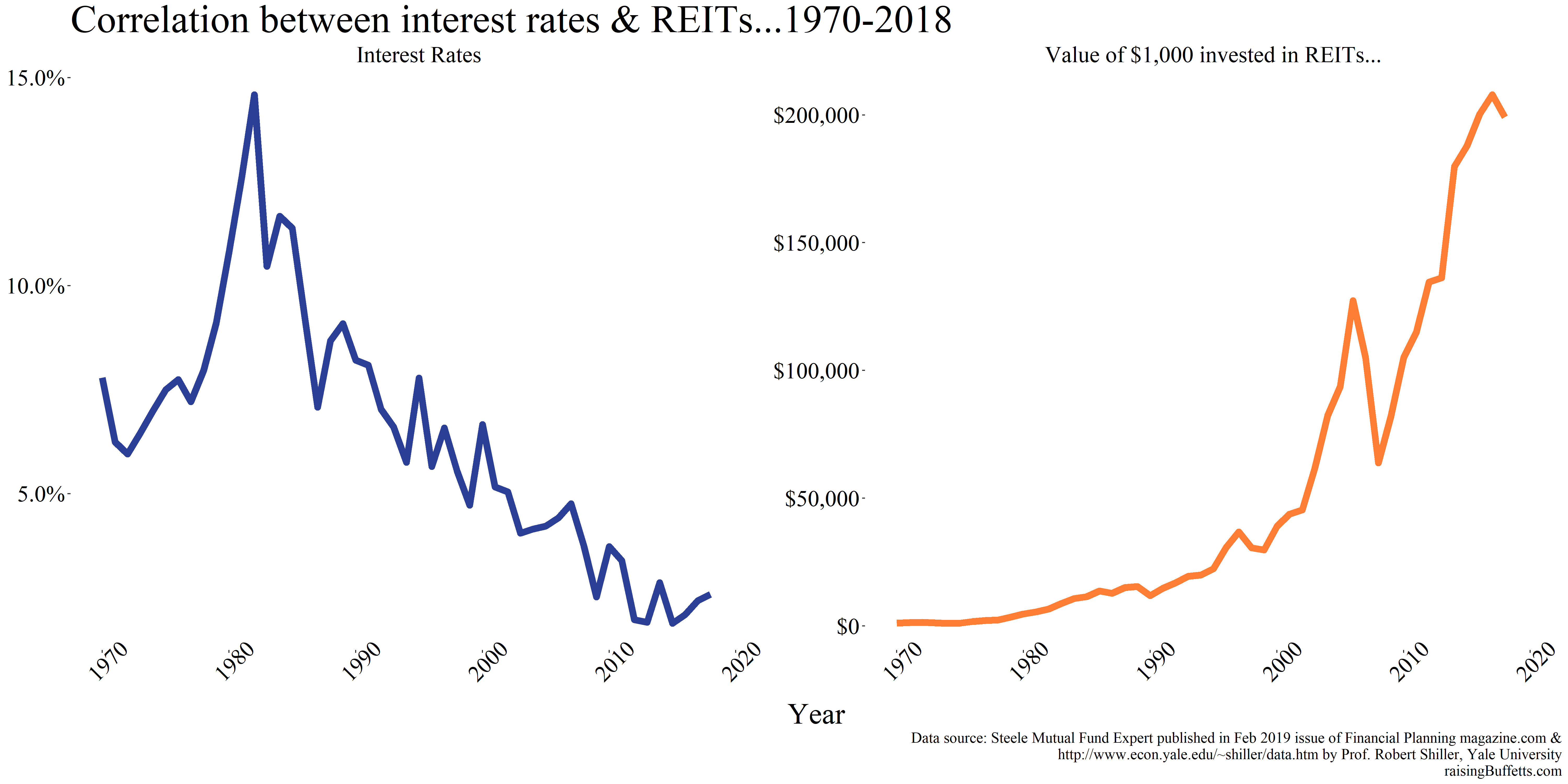
Real estate is packaged commodities. It just sits there. It does provide a service and that is shelter but beyond that, not much. It’s not going to create a cure for cancer or reinvent the way how we live or travel or communicate. It’s also an extremely interest rate sensitive asset and likely more so. We see evidence of that with the obvious negative correlation above between rates and an investment in REITs. Can the REIT out-performance continue? Very unlikely.
But it’s not that you completely ignore this theory. You use a bit of it and a bit of your understanding of history, business and the economy and create a portfolio that is just right for you. I’ve shared some of my thoughts on how to go about doing that here and will do more from time to time. But in the end, you are the one who will have to persevere and endure all the ups and downs associated with your choices in the coming decades. Because as Morgan Housel quotes,
Something stupid you can stick with will probably outperform something smart that you’ll burn out on.
So your ability to stick with what you own in your portfolio provided you have justifiable (to you for sure) and quantifiable reasons to own what you own is what will ultimately count.
So long and long.
Until later.
Cover image credit – Quang Nguyen Vinh, Pexels