

Pretty much everything in our daily lives, if we were to collect enough data and observe, follow a bell-shaped pattern or dare I say, distribution. Take for example, women’s weight. The average or mean weight say is 150. I didn’t say 150 what so don’t come at me. And there is of course a spread around that average. Some women weigh less than the average and some more. So there is volatility around that average and that spread is quantified by something called a standard deviation. The higher the standard deviation, the more flatter and the more spread out the distribution would be. The plot below is based on 1 million data points with mean weight of 150 and standard deviation of 25.
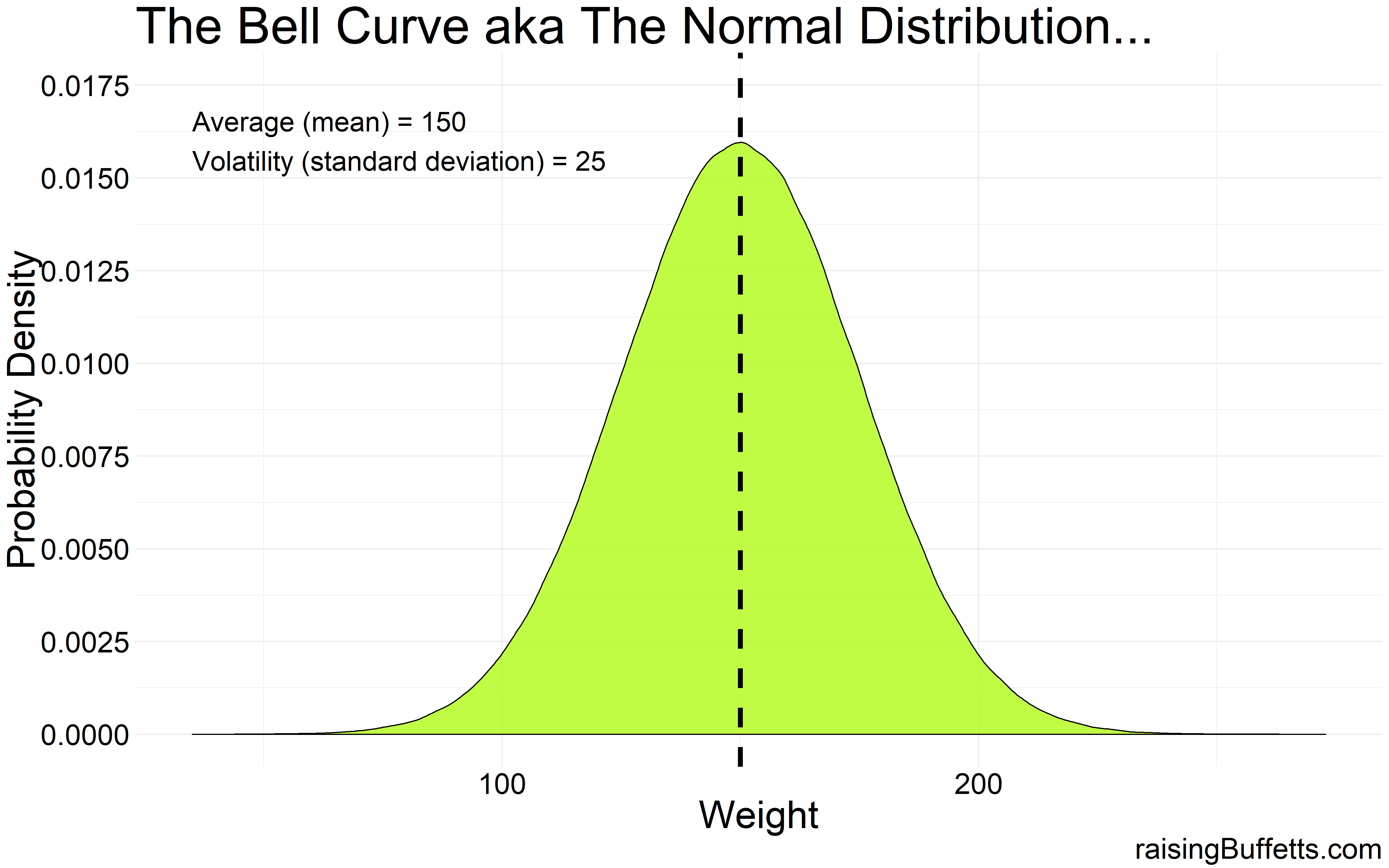
So a very clean bell-shaped distribution.
But instead of say having access to 1 million data points, what if we had only 100 data points? The underlying population is still normally distributed but because of the smaller sample size, the distribution might not quite look bell-shaped which is what we were expecting.
It could look something like this…
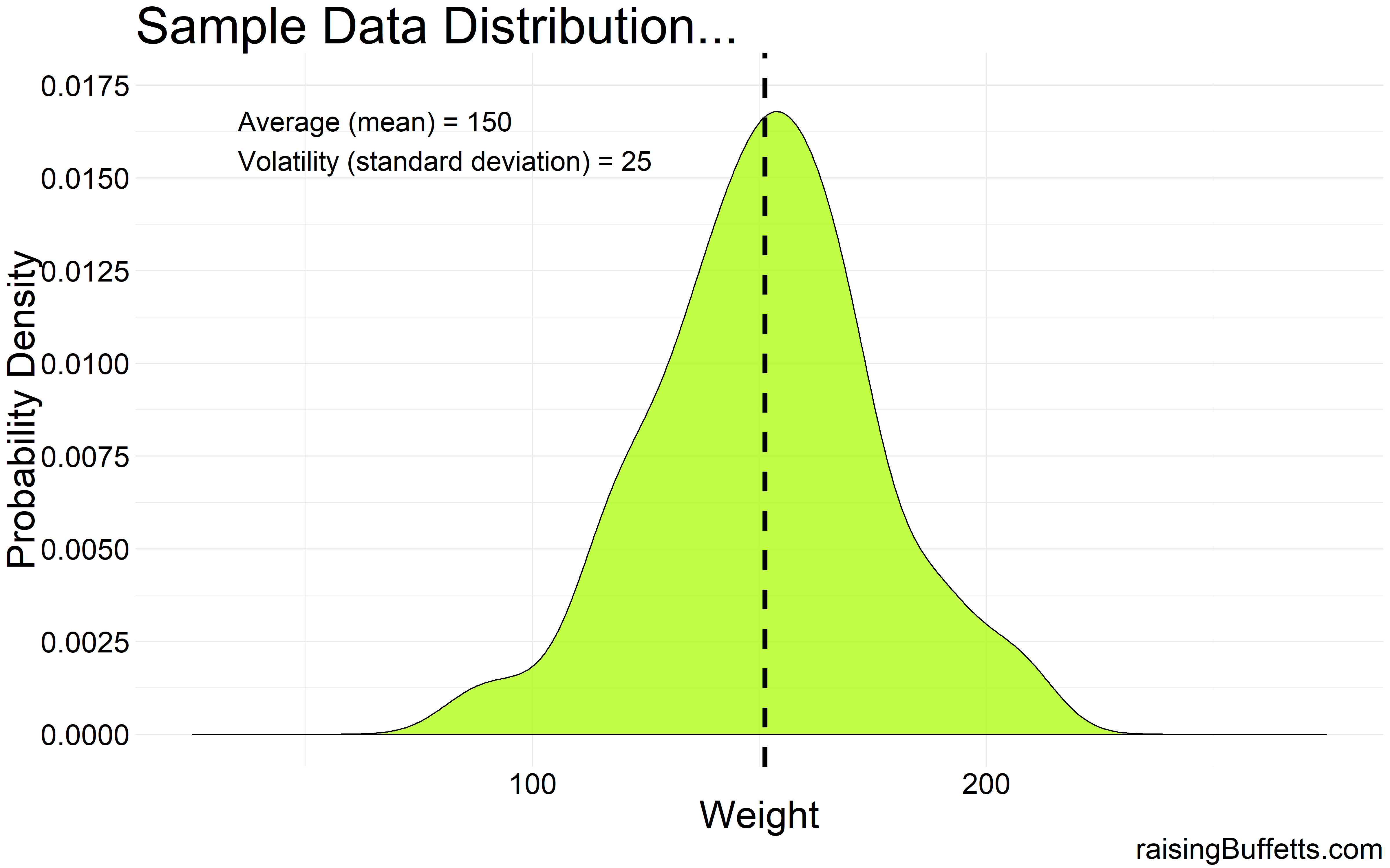
So that’s the difference between dealing with sample data vs. population data. You could be dealt any hand possible based on the size of the sample you collect and the differences between sample to sample can sometimes be big. A given sample could precisely represent the population or could be a completely different distribution altogether even though the underlying population distribution is still normal.
So now that we got that straight, what does that have to do with our money? The plot below is the performance distribution of the two dominant asset classes that we have reliable data on over the past 90 years. Stocks here are represented by the S&P 500 index and bonds by the 10-year Treasury bonds. You could replace S&P 500 with a diversified global stock portfolio and you’d get more or less the same distribution but because global stock market data going that far back is not readily available, we use S&P 500 as a proxy.
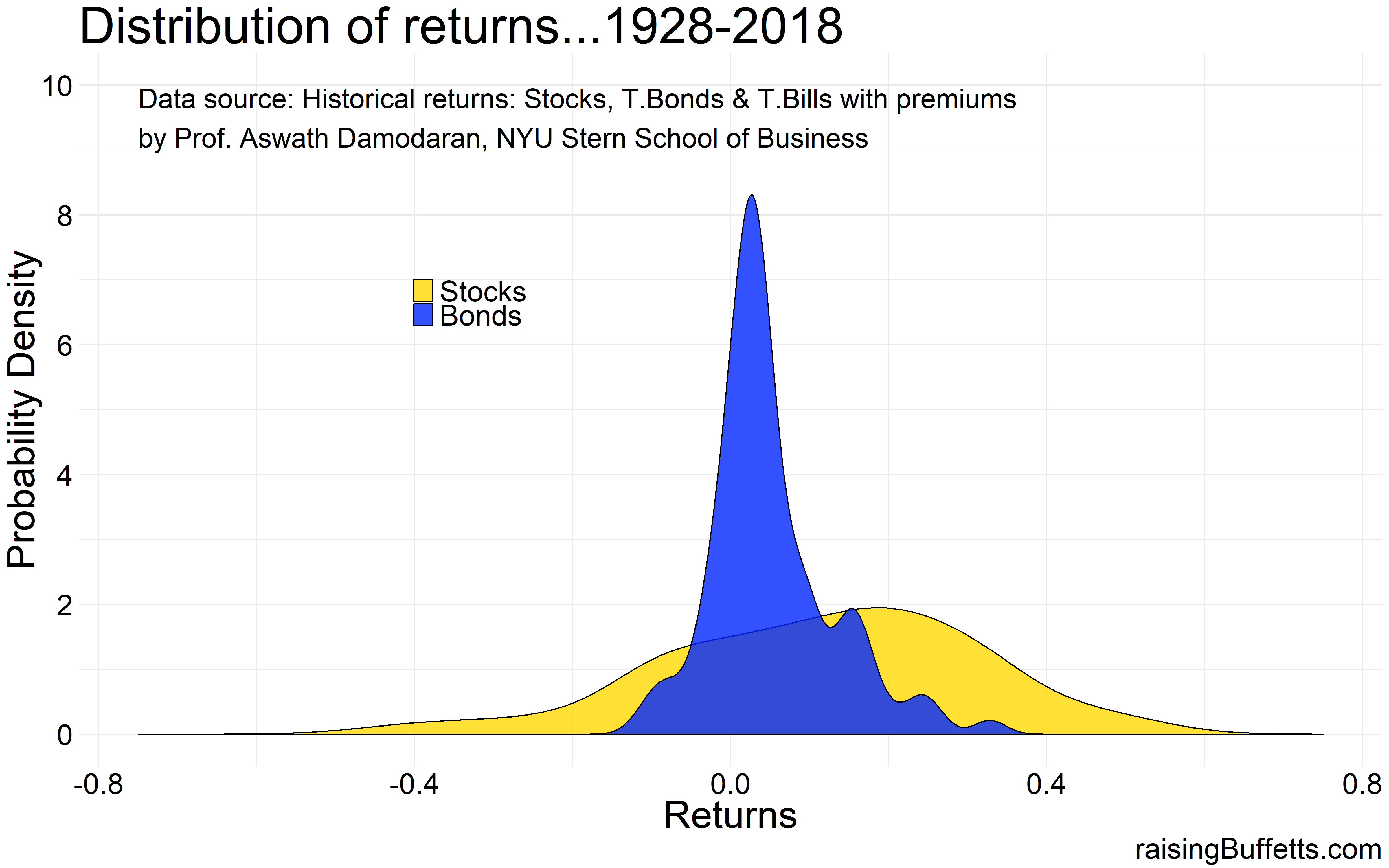
Stocks are more volatile than bonds. We know that and we can see that from the comparison of the spread between stocks and bonds. And I don’t know about you but neither of these distributions look bell-shaped to me. That’s because though we have data on 90-years of performance for these two asset classes, they still represent a small subset of the population of all the returns that have happened before and all the returns that will materialize in the future. So the underlying distribution of the stock and bond market returns could still be normal and if we assume that, here’s what the distribution of returns could look like for the two asset classes over a span of say 1,000 years 😎 .
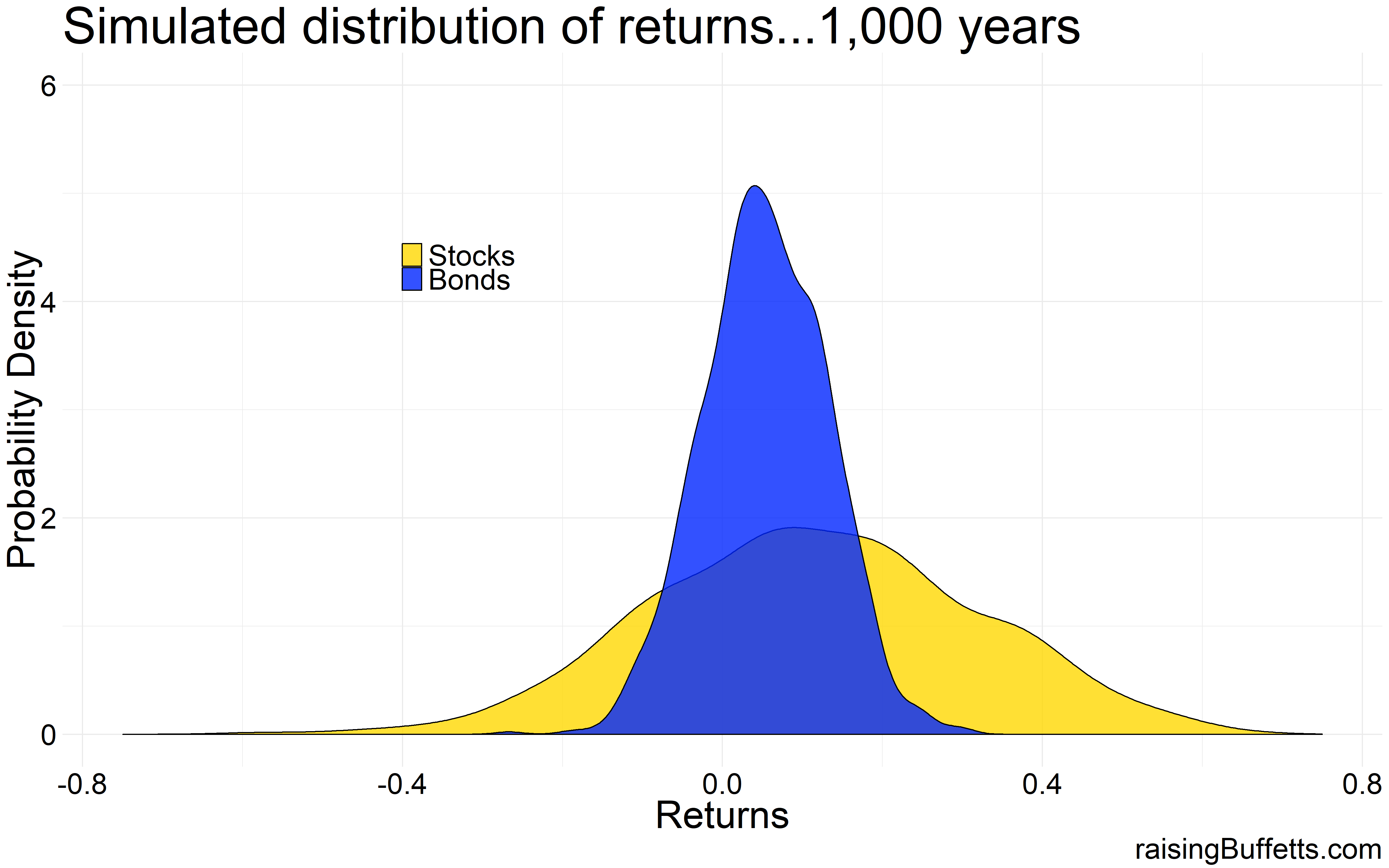
Almost bell-shaped. So the underlying distribution can be assumed to be normal even though the 90-year sample does not look anywhere close to normal. And unfortunately, we have to make that assumption to assess the impact of these statistics on our portfolios. And our lives.
So now that we got that straight, say you are a young whippersnapper with a 40-year investment time horizon. Your time horizon in reality is much longer than that but let’s just stay with this for now. You have some cash that you’ve saved up and you want to plunk that down in a portfolio of stocks that yields on average say 7% during that 40-year time frame. Why stocks? Because you are young and you can afford any level of volatility (these words could come back to haunt you) the market throws at you. And 7% for an all-stock portfolio is lower than what the markets have yielded historically but we know the valuation and the interest rate drill and hence 7% sounds about right as an assumption.
So what would you have in 40 years if a single $1,000 were left to compound at 7%. $14,974 or rounding that off to say $15,000. So that’s 15x your money.
What’s missing? That 15x assumes a constant 7% return each and every year. That of course is not real. Markets don’t move in averages. They can fall a few years in a row, then be up a few years and so on. That’s volatility and the difference with different levels of volatility on the final accumulated wealth can be yuge.
To prove that, we simulate by drawing 10,000 samples of 40-year interval from a population of portfolio returns that is normally distributed but with varying levels of volatility.
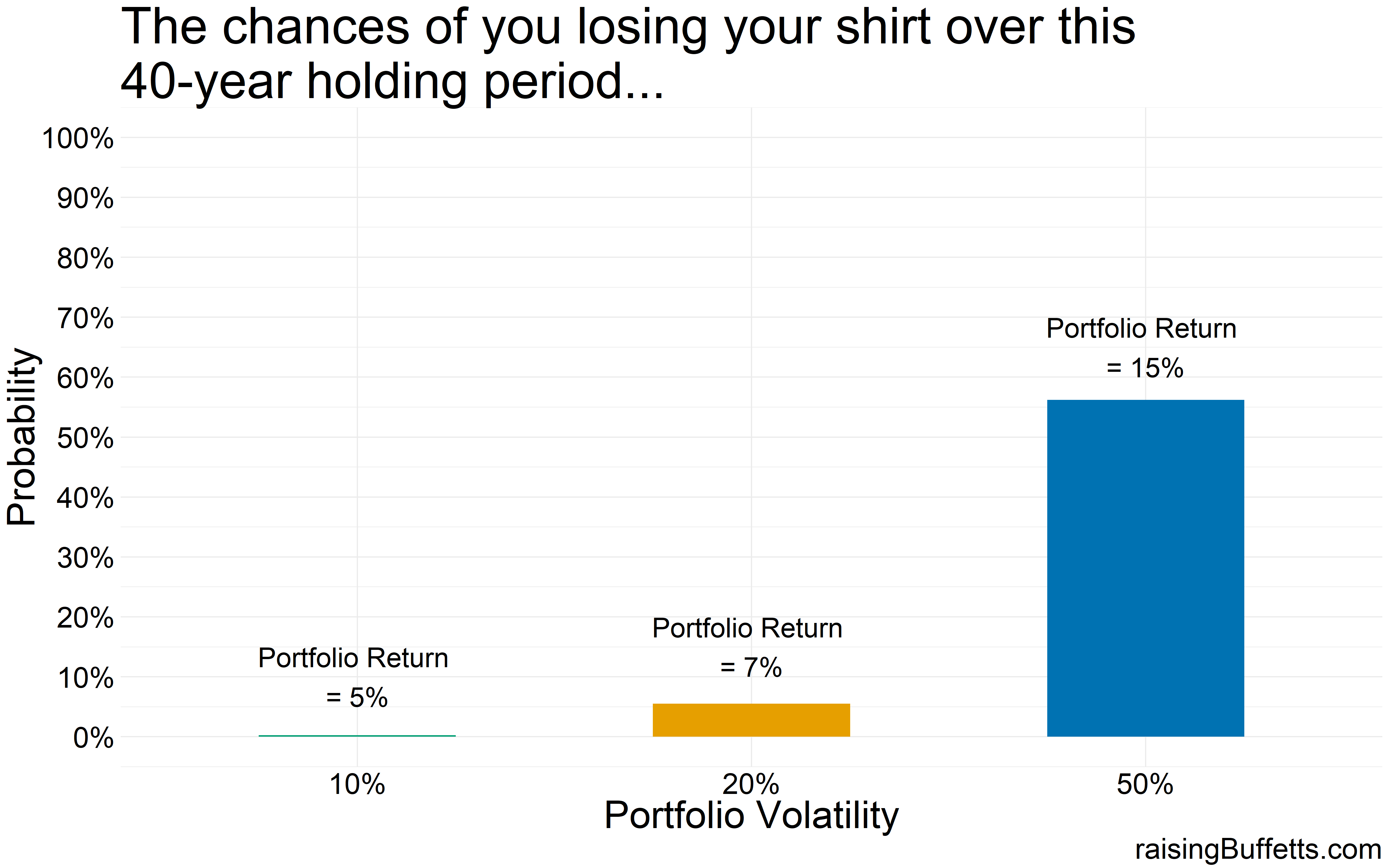
And here are the results starting from the worst-case (losing your shirt) to the best-case (making a killing).
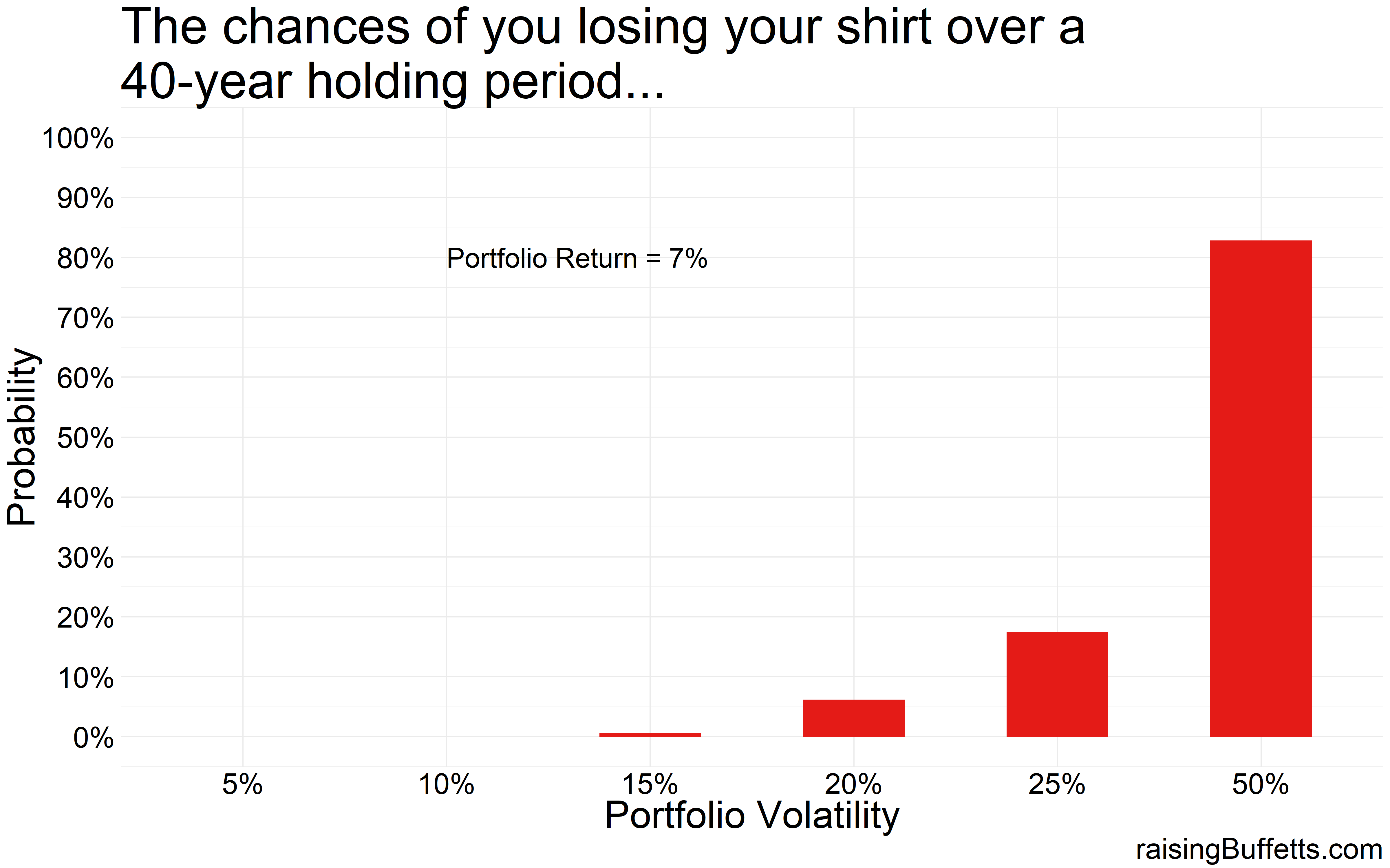
So with a 50% volatility, 85% of the portfolios lose money over this 40-year time frame. This is akin to a more venture type of investing and you might want to do that with some portion of your portfolio but not with your entire portfolio.
Or this could also be an outcome of a very concentrated portfolio of stocks.
Historically, the standard deviation (volatility) associated with a broadly diversified stock portfolio is around 20%. With bonds, it’s about 6%. You mix the two and you really have to try hard to push the volatility beyond 15%. So in theory, you almost never lose money with that portfolio. Or at least you didn’t historically.
But avoiding capital loss is not your only goal. You are doing all this to also make some money because you can be a wage-slave for only so long.
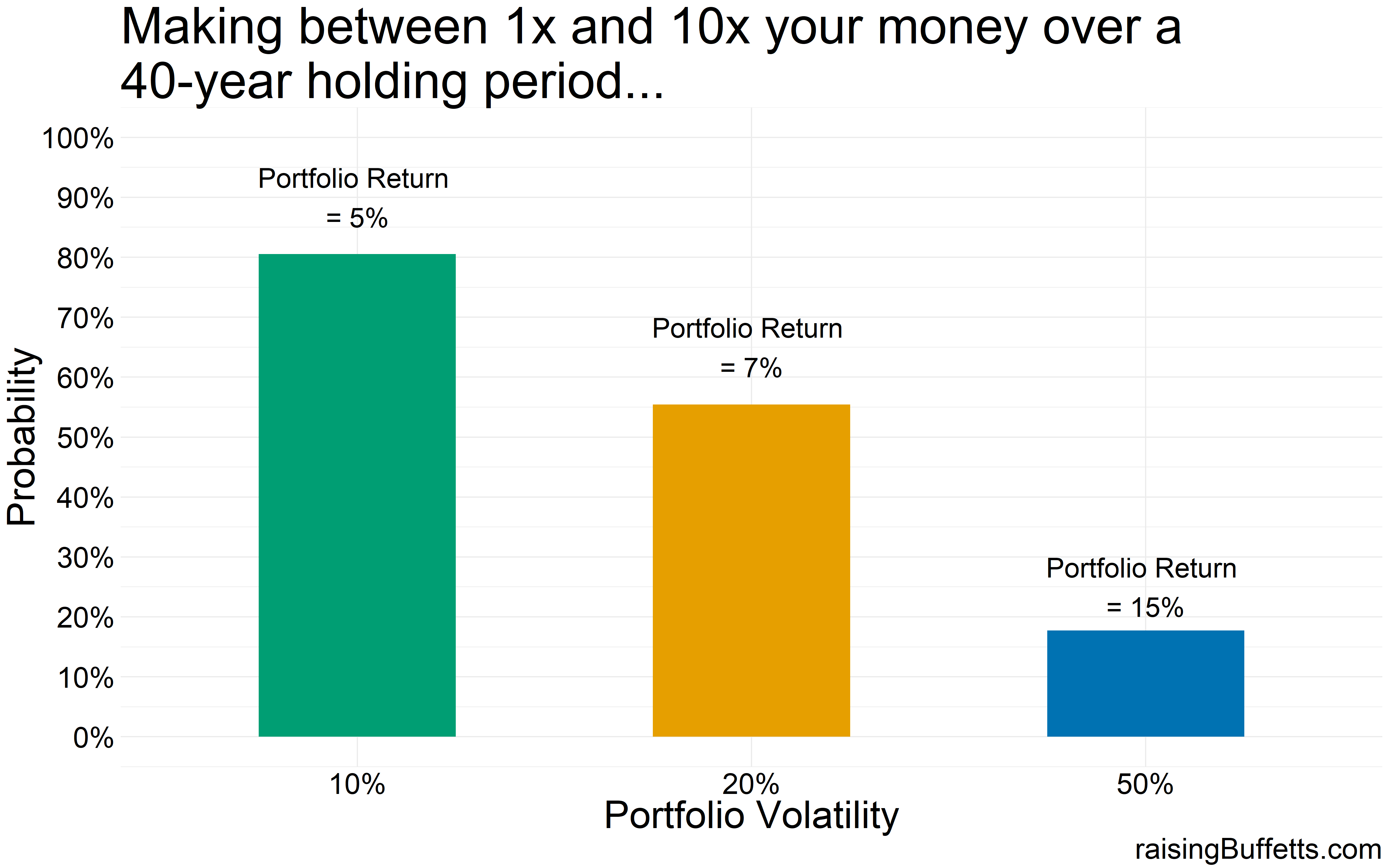
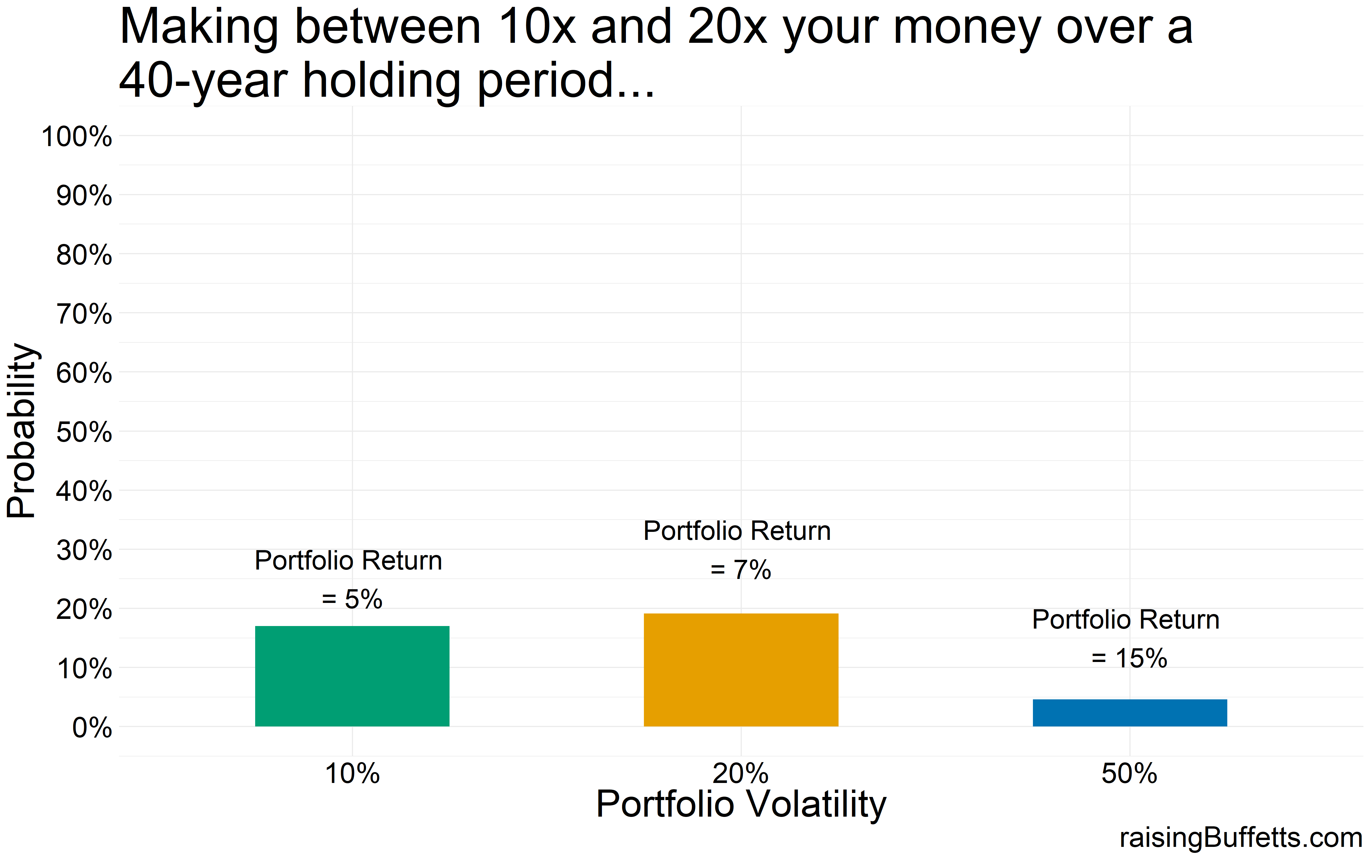
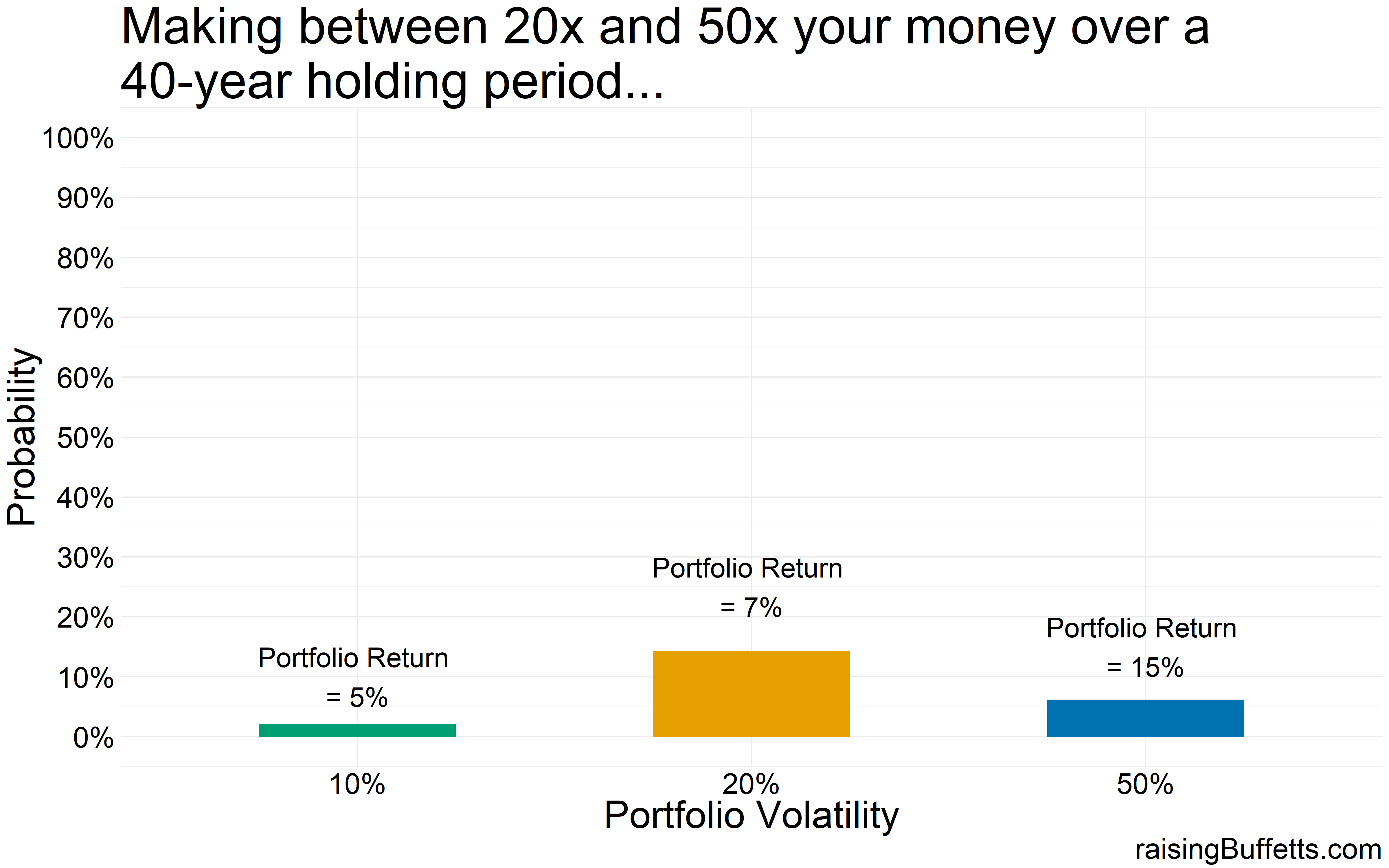
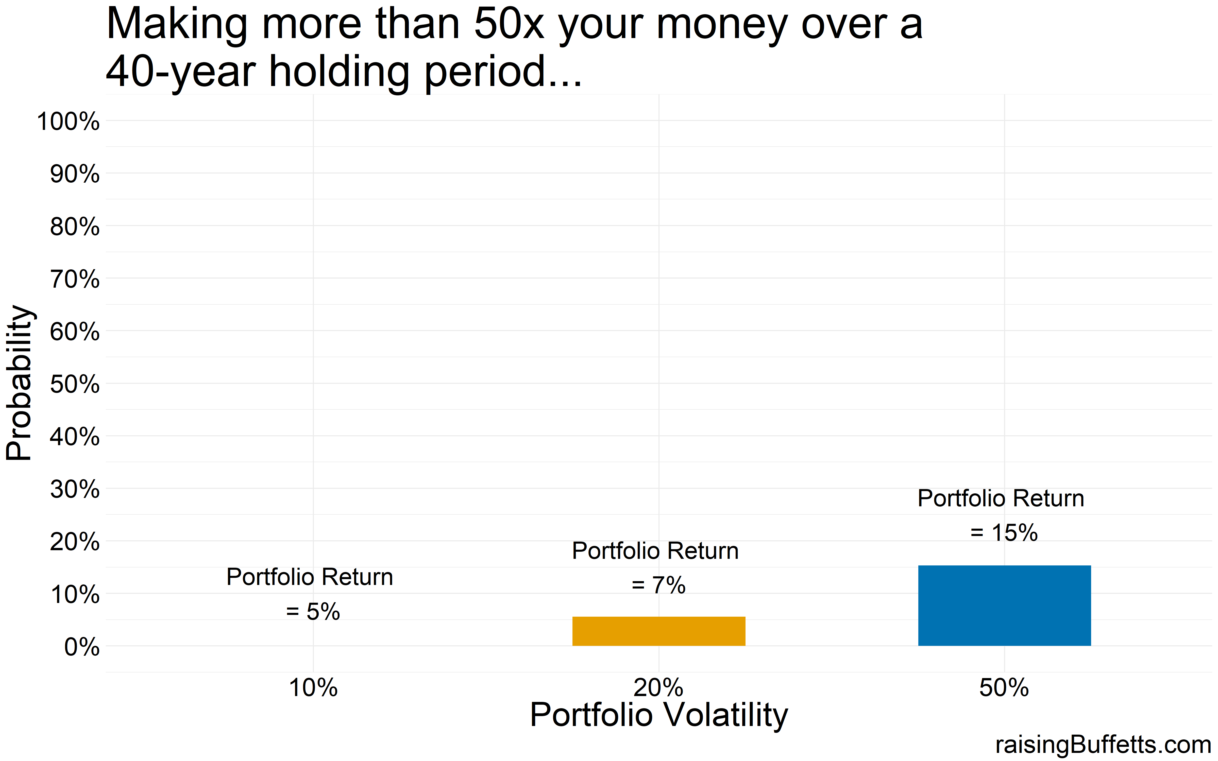
So some more data on just how much are you able to grow your wealth by with different levels of volatility but with the same average return.
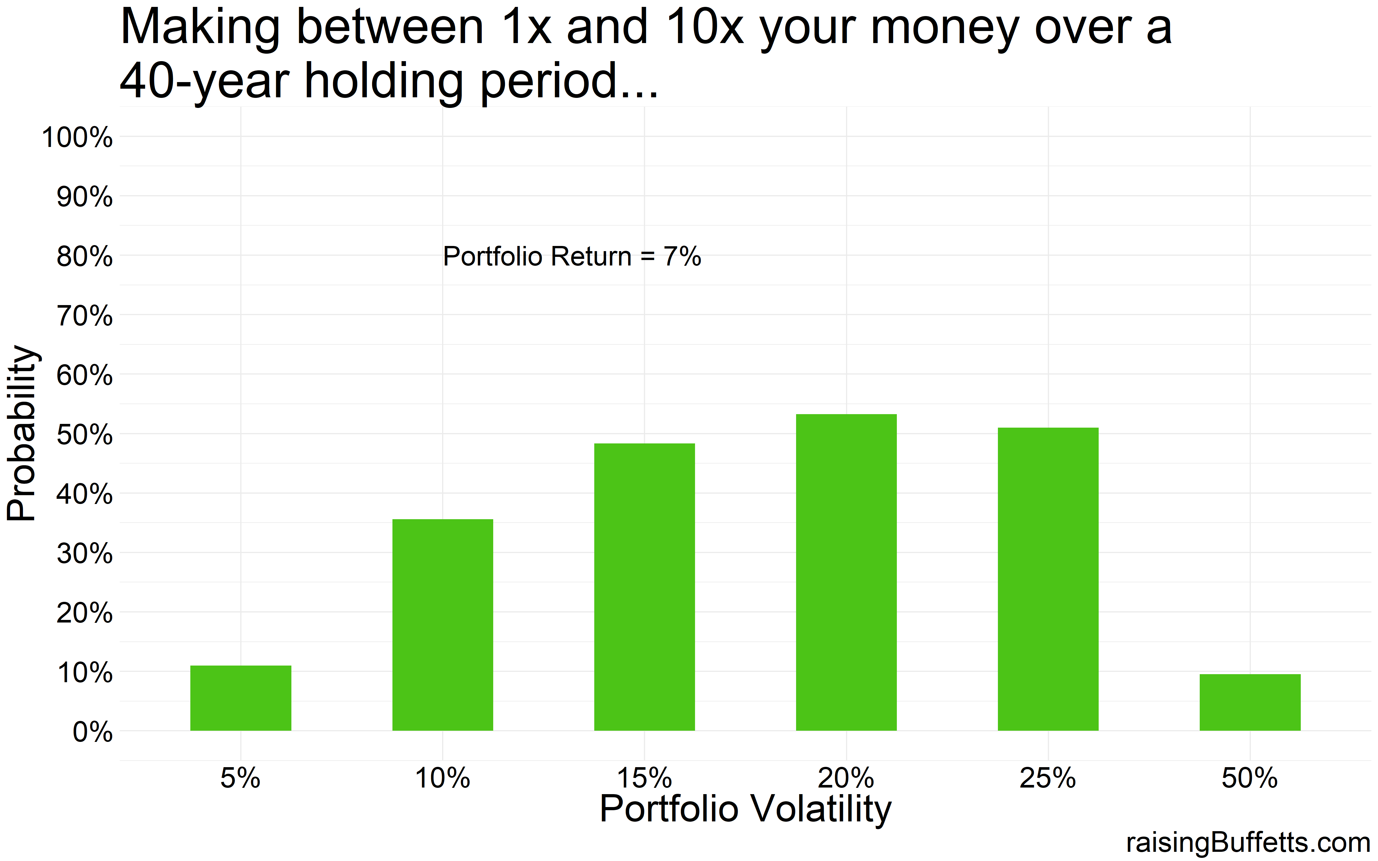
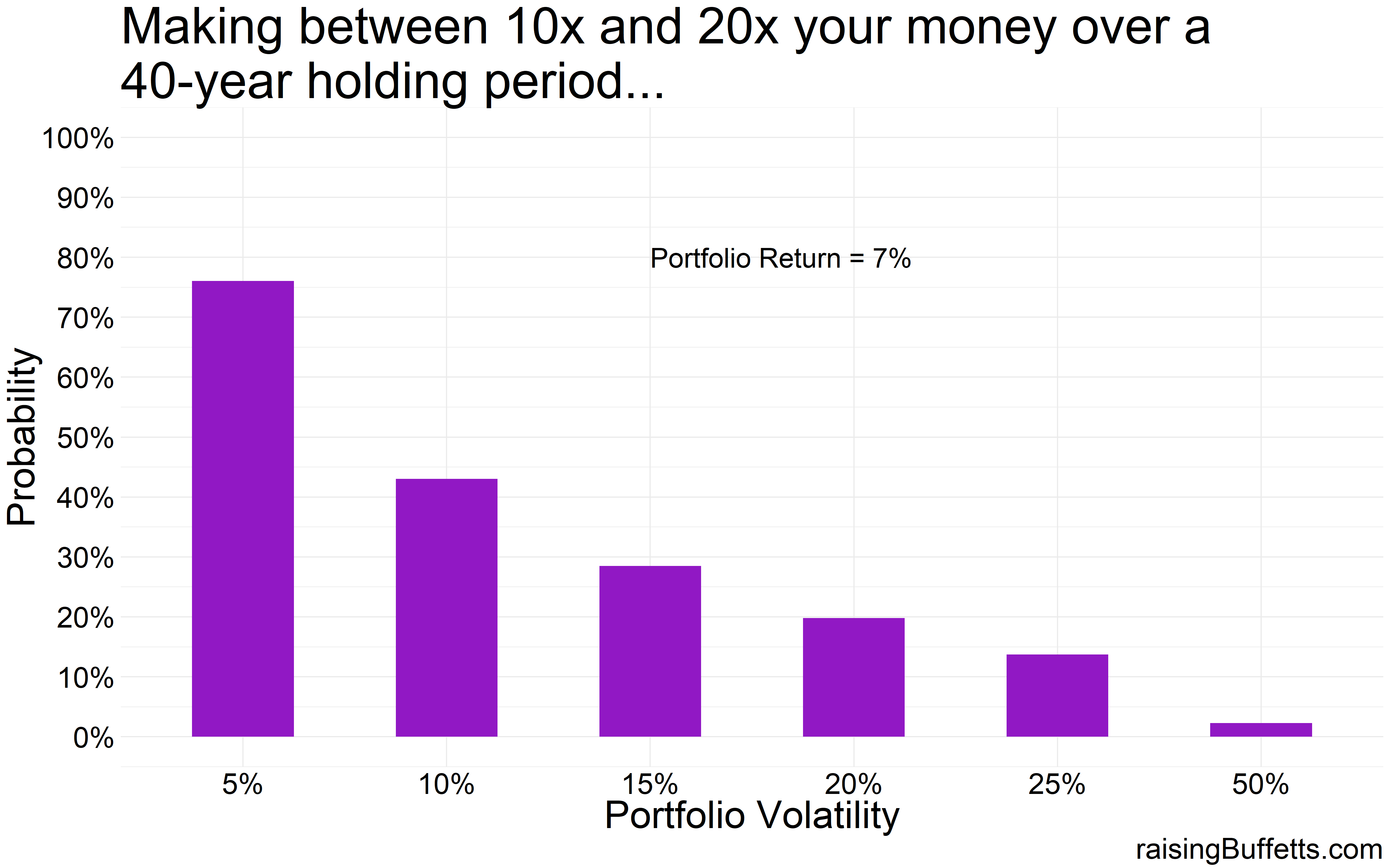
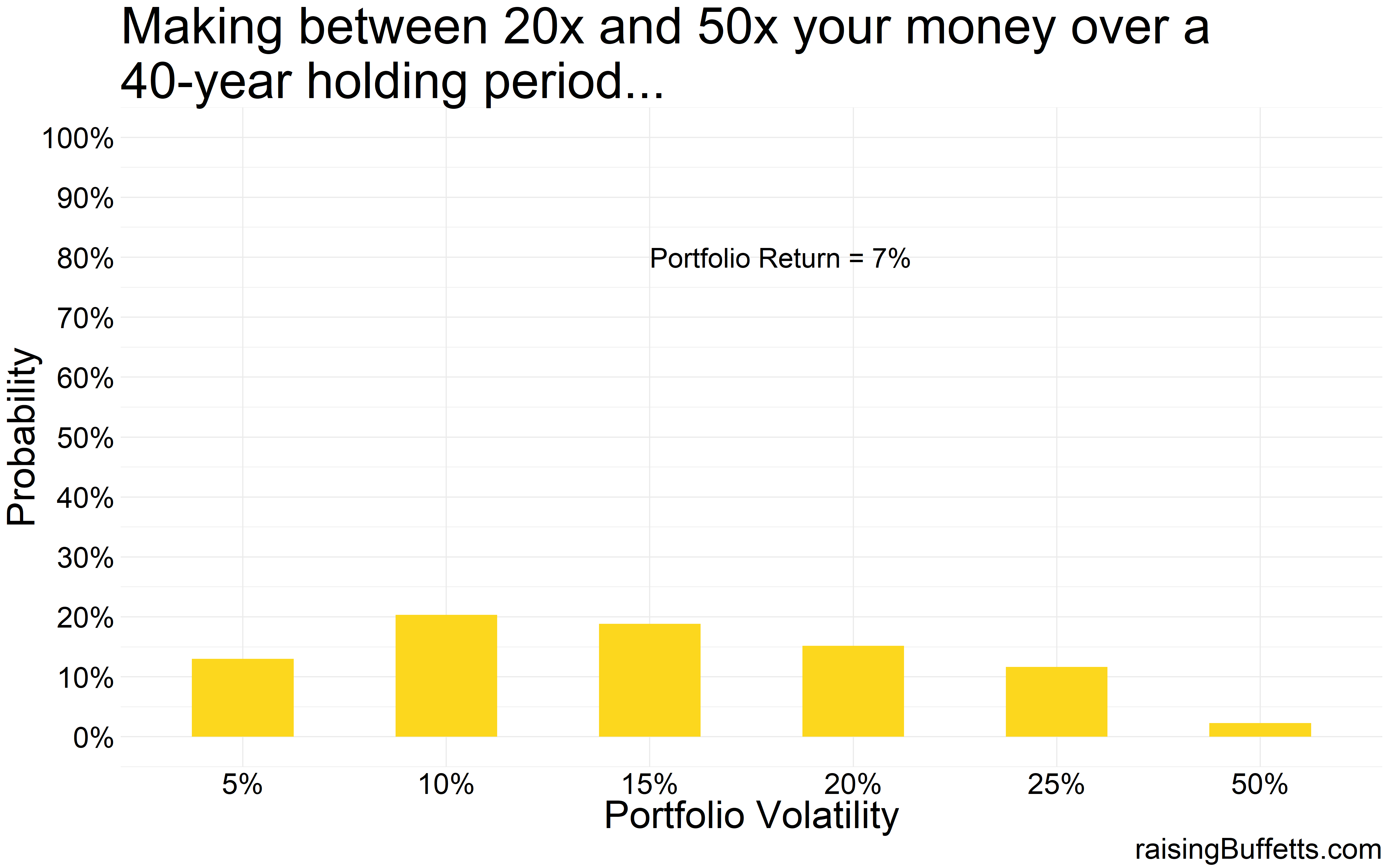
One thing is clear. Off the chart volatility kills as is evident by the 50% volatility mark in all the plots. You lose most of the time. Plus the probability of you making a killing are so infinitesimally small that you’d rather not try. But then this is where a collection of most small businesses and start-ups lie so not trying is also not good for you and me and the economy. It is these risk takers and investors willing to fund these ideas and businesses that creates this quality of life we take for granted. So we take those chances and we should but with a small portion of our portfolios.
And you don’t have to take crazy risks to do well over time. A portfolio with 5% volatility takes you quite far almost all the time. Yes, you are less likely to make a killing as shown by the ‘no bar’ in the ‘more than 50x plot’ above but you are likely to always match and exceed inflation.
And sometimes that’s all you need, especially during retirement.
Plus any portfolio with volatility less than 15% always made you money and at most times, a lot of money.
And if you are dollar-cost averaging through this 40-year investment timeframe, even an all stock portfolio works, especially during the early phase of your accumulation cycle.
But what you haven’t asked and what you should be asking is, who would go for portfolios with crazy volatility yet only earn 7% returns on average? We know the risk-return trade-off. The more risk you take, the more in terms of a return you should expect.
So then we analyze situations where returns are different – lower returns for a less volatile portfolio and higher returns for the more volatile one. That is, you are getting compensated for taking those crazy risks.
But do you really get compensated for taking those risks in the long run? Back to the data again…
The situation improves a bit for the crazy volatile portfolio but you still end up losing your invested capital 60% of the time.
So the probability of you making a killing with a highly volatile portfolio improved but not by much. In fact, a vast majority of portfolios that return 5% with 10% volatility do better that the portfolios that return 15% but with 50% volatility.
So the moral of the story is to shoot for decent returns that will allow you to meet your goals but ignore volatility at your own peril. And in fact, if given a choice between a higher return but a more volatile portfolio compared to a lower return, less volatile portfolio, choose the latter. Not only will you sleep easy but you’ll sleep easy while getting rich.
Until later.
Cover image credit – Paulo Valdivieso, Flickr